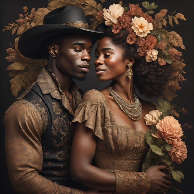
In the fiercely competitive world of books, it’s not easy for writers to make their voices heard and their stories known. But as writers, we have the power to captivate readers from the very first glance. How, you may ask? The answer lies in designing attention-grabbing book covers. A well-designed book cover can not only draw potential readers in but also convey the essence of your story. So, let’s dive into the art of creating book covers that stand out on the shelf.
1. Know Your Target Audience
Before you even pick up a pen or start exploring design options, it is crucial to understand your target audience. Writers often make the mistake of trying to appeal to everyone with their book covers, but this approach usually falls flat. Instead, narrow down your audience and design a cover that resonates with them. Are you writing a mystery novel for young adults or a self-help book for middle-aged professionals? Understanding who you are targeting will guide your design choices.
2. Research, Research, Research
Once you have a clear idea of your audience, it’s time to dive into research. Spend time browsing through physical and online bookstores to get a sense of the current trends in your genre. While you don’t want to copy others, it’s essential to stay informed about what is working and what is not. Look for successful book covers that catch your eye and try to identify the elements that make them visually appealing. Pay attention to colors, typography, and overall composition.

3. Make Typography Count
The typography you choose for your book cover can make all the difference in capturing attention. Bold and distinctive fonts can help convey the tone and genre of your book. However, avoid going overboard with overly complex or hard-to-read fonts. Remember, readability is key. Experiment with different font combinations to find the perfect balance between aesthetics and legibility. Don’t be afraid to hire a professional graphic designer or typographer if you need assistance.
4. Colors that Demand Attention
Colors have the power to evoke emotions and create a lasting impact. When it comes to book covers, selecting the right color palette is crucial. Take into consideration the genre of your book as well as the emotional tone you want to convey. For example, vibrant and contrasting colors like red and yellow can grab attention and create a sense of excitement, but they might not suit a somber thriller. Remember that colors evoke different emotions and influence how potential readers perceive your book. Choose wisely.

5. Embrace Simplicity
In a crowded marketplace, simplicity often reigns supreme. A cluttered and overly complex book cover can confuse potential readers and leave them disinterested. Instead, choose a clean and straightforward design that immediately communicates the theme of your book. Remember, less is often more. Utilize negative space to create breathing room and let the central elements shine. A bold and striking image paired with minimalistic typography can make a compelling statement.
6. Create a Strong Visual Concept
A captivating visual concept lies at the core of an attention-grabbing book cover. The image or illustration you choose should entice and intrigue potential readers. Whether it’s a stunning photograph, a beautifully illustrated scene, or a symbolic representation of your story, the visual concept should be an extension of your narrative. When selecting or creating an image, consider how it conveys the essence of your book and piques curiosity. It should be visually striking, evoke emotions, and most importantly, make readers want to delve into your story.
7. Stay Consistent with Genre
While it’s essential to stand out, it’s equally crucial to stay consistent within your genre. Potential readers often rely on visual cues to identify books in genres they love. If you’re writing a romance novel, your book cover should evoke a sense of romance, not mystery or horror. Reflect on the color palettes, imagery, and typography commonly associated with your genre. Striking the right balance between uniqueness and familiarity can be the key to attracting potential readers who are already drawn to your specific genre.

8. Test and Refine
Once you’ve crafted your attention-grabbing book cover, it’s time to test its effectiveness. Create mock-ups or seek feedback from trusted friends, fellow writers, or even potential readers. Does your cover make them want to pick up the book? Does it effectively convey the genre and mood? Don’t hesitate to make revisions until you have a cover that truly grabs attention. Remember, your book cover is your first impression, and you want it to be a lasting one.
Designing book covers that grab attention requires careful thought, research, and creativity. By understanding your target audience, staying informed about current trends, and employing effective design principles, you can create a cover that stands out on the shelf and captivates potential readers. So, don’t underestimate the power of a well-designed book cover. It can be the gateway to your story and the beginning of a beautiful journey with your readers.
READ MORE
Amazon’s Marketing Tools for Authors
RECOMMENDED READING
The Beginner’s Guide to Book Marketing: How to Market a Book using Simple Marketing Strategies


